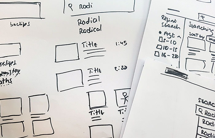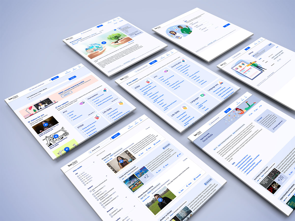
During the early stages of user testing, we mostly used prototypes in wireframe or low fidelity form, so when it came time to build the platform, these needed to be translated to a more visually appealing form.
The color palette and visuals had to speak to a very wide audience united only by their job. That meant it had to be quite straightforward in terms of colors and what they represented.
Given the wide ranging profile of potential users (eg. in terms of age, tech literacy, etc) the platform needed to exude professionalism but not in an intimidating way, i.e., it needed to toe the line between seeming a professional authority but while also appearing friendly, accessible and non fussy or alienating.
I chose a shade of bright blue as our main anchor. Not only is blue a widely liked color (seen as safe and non-threatening) but psychologically is associated with trust, wisdom, and knowledge, traits we’d like associated with the platform. I committed to pursuing a clean and simple approach that resorted to pops of color only when strictly necessary to ensure that users didn’t get distracted from what should be the main focus of attention: our content. The supplementary palette consisted mostly of a set of light colors complementing the main shade.

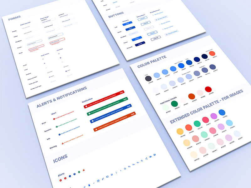
Styleguide
Creating a visual language from scratch provided the perfect opportunity to define a set of reusable components from the get-go. Mapping out a uniform palette and UI building blocks (in terms of visuals and behaviors) to which both designers and developers could refer to, time and again helped ensure a consistent experience throughout.
With the platform's functionalities expanding, the style guide grew steadily and new elements were added whenever necessary.
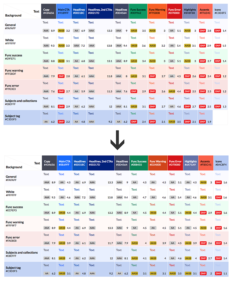
Accessibility
In retrospect, as a product geared towards education, it feels like this should have been at the forefront of everyone's thoughts all along but in the rush of getting something out of the gate as quickly as possible, it took us a while to circle back to this.
As we wanted the platform to be usable by as many teachers and students as possible, the team did an audit of the platform to see where our gaps were. As a result, I slightly altered the color palette to ensure it respects WCAG 2.0 level AA color contrast rules and made some adjustments to the UI.
Ultimately, it proved to be a learning experience, as the insights gained during the revision process allowed me to gain the knowledge necessary to develop an accessible product from the start.
Illustrations
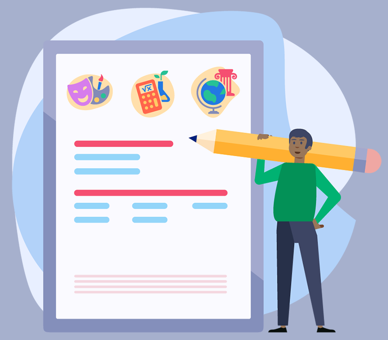
I developed a simple flat illustration style to help bring some life to the product and give teachers characters to identify with. Two teacher characters and a student are consistently used throughout not only our app but also in all of our assorted marketing material.
Simultaneouly I further extended the secondary palette with a set of color designed to be used in illustrations only.