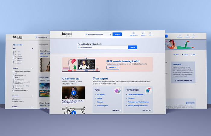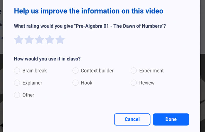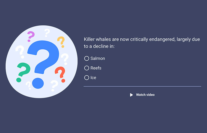

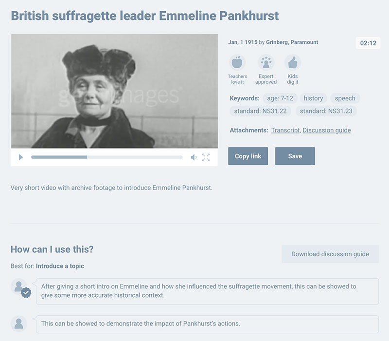
When I joined the team (as the first UI/UX designer in the company) the seed of the product had already been planted. The company already had a platform geared towards a publishing audience and a copy of that had been made with a few minor tweaks, to test whether there was a need in the teacher market for this type of platform.

Initially, I reviewed the new version of the old platform. Having created a list of UX improvements we wanted to dig further and so conducted a round of usability tests which provided a much-needed eye-opener. It was clear that a great deal of work was required to bring the platform from where it was now, to where it needed to be.
Simultaneously, a freelancer was hired to do some exploratory research to understand what struggles teachers faced when using video in the classroom. We discussed the results of this research in a session where the team grouped the pain points into themes through an Affinity Diagram. The purpose of this was to see how much the adapted platform already spoke to these and to guide us towards potential new developments.
After evaluating all the information, we concluded that the current platform didn’t provide a solution to teachers’ problems. However, the concept had legs to stand on, even though the way it was being delivered wasn’t yet fit for purpose. With that in mind, the decision was made to scrap the initial approach and start from scratch.
Google Sprint
Once that decision was made, it was time to get everybody’s thinking caps on. At that point, the possibilities seemed fairly broad so we needed to reach a consensus on a direction everyone in the team could get behind. The next step was to go through a Google design sprint to get a clear sense of focus. Described as the ‘greatest hits of business’ in a compressed format, the design sprint seemed like a good way to address all the questions that were bubbling in the teams’ heads.
For the design sprint, representatives of key areas across the business met in a tiny office for 5 days to undergo an intensive brainstorming session. The design sprint concluded with 2 distinct prototypes being shown to a few teachers.
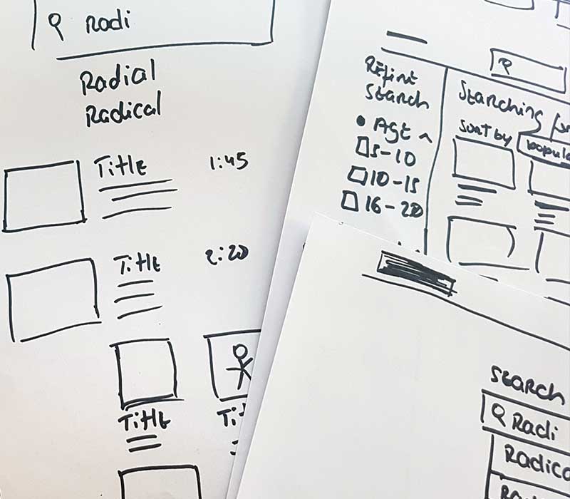
The first was a digital version, designed to offer teachers videos packaged into lessons. The second was a paper prototype that relied on a more streamlined approach, displaying videos in a social media type feed. In the end, the paper prototype won the teachers over since they were confused by certain aspects of the digital prototype. The teachers thought that the very specific tailoring of lessons displayed in the digital prototype might not address their varied requirements.


Prototypes
Now that the direction was clear, it was time to go from a nugget of an idea to something fully fleshed out. We used the parts of the previous prototype that resonated the most with teachers, along with the feedback that had been gathered initially in research to try to bring in some flesh to the initial skeleton. That allowed us to try new ideas for features and enhancements in the following iterations of the prototype.
With each change, we conducted user interviews with teachers to gather feedback on the changes. By constantly speaking to teachers we didn’t waste time pursuing ideas that didn’t resonate or bring them any value.
Eventually, after a few weeks of prototype iteration and feedback gathering we had something to unveil! A low fidelity prototype which allowed for a complete journey proved a success among the team and with that, we moved on to develop a visual interface and implementation.
