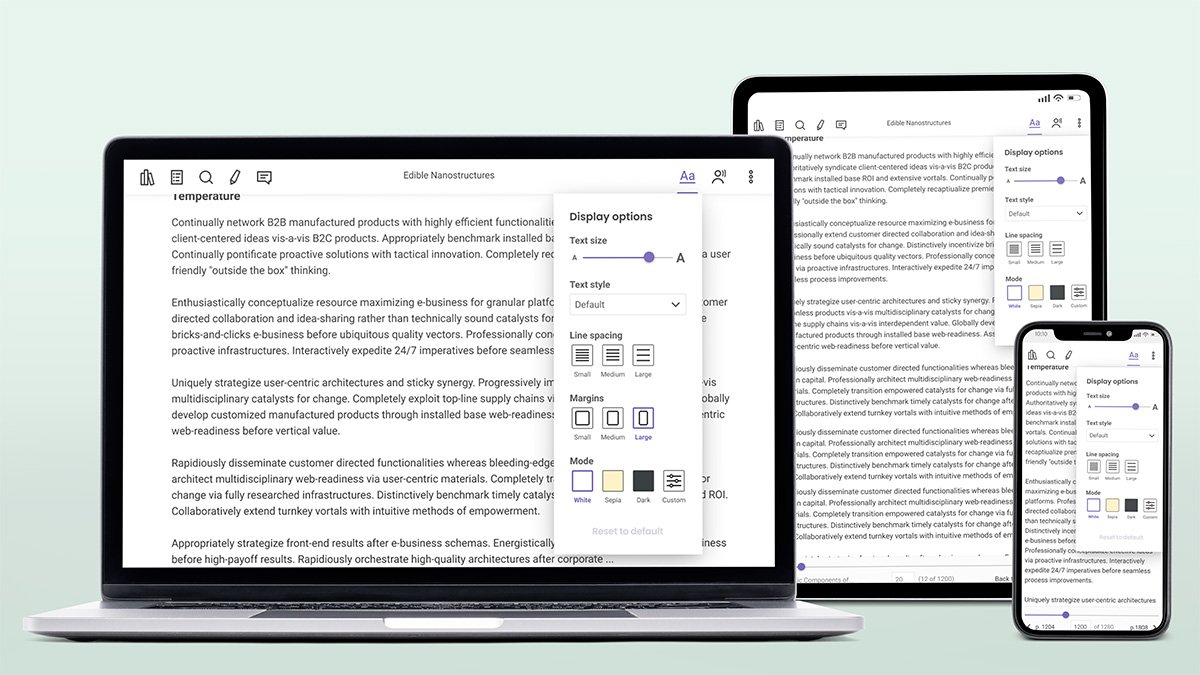
One of the company's products is a student reader app that was provided to students to access the books available. Given that university students can be comprised of a wide diverse population, it was important to ensure the tool provided the best possible reading experience to all of them. That meant that not everyone had the same needs in terms of reading configuration.
Initial steps
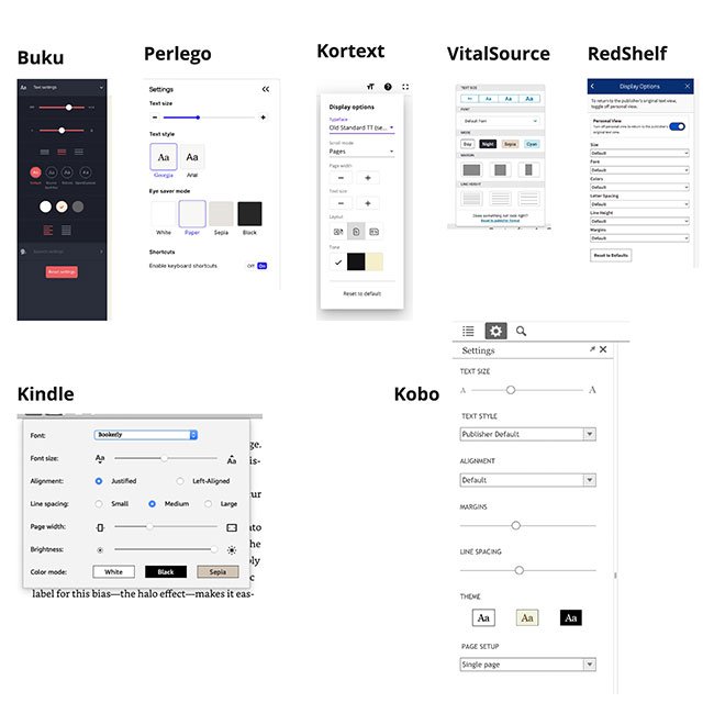
First steps were twofold: on the one hand I did a deep dive into what competitors and similar applications (ie ereaders) were doing in this field to understand what market expectations were. Simultaneously, I also did research into how humans read and what can help improve the readibility of large blocks of text.
Making choices
Once I settled on a set of expected configuration settings and validated their feasibility with the engineering team, I then procedeed to understand what the specific options offered should be and how to present them to the users.
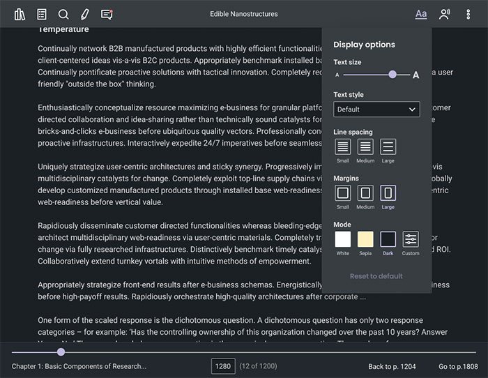
I looked at offering a range of fonts and my main choice criteria was around providing a range that addressed different accessibility needs. That meant using some commonly available fonts (like Arial, Verdana and Georgia) since familiar
typefaces are easiest to parse and read and making sure they were ADA approved. Other fonts were chosen to address specific disabiblities (Open Dyslexic for dyslexic users and Atkinson Hyperlegible for the visually impaired).
For displaying the choices I selected a dropdown for the MVP stage purely for ease of implementation, the idea being that the following iteration would feature a dropdown with written samples.
Due to the specificities of certain file formats, changing font size wasn't always easy and straight forward to do technically, so a slider was used, so that the change wasn't in absolute terms but relative to its original size, which would allow for variations between different publications.
The iconography used was selected with the help of usability tests to ensure they resonated visually.