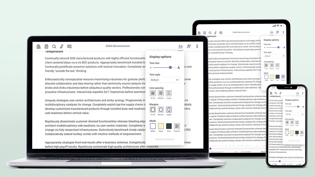
Part of BibliU's offering includes an administration portal that among other things, allows university librarians to directly purchase the books made available to their students.
The team decided to looking into how to improve this part of the experience and as a more measurable consequence the amount of purchases.
User journey
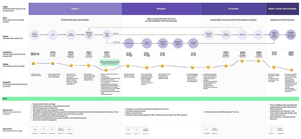
My first step in tackling this issue was to get a better understanding of the current purchase process. For that I mapped out the steps a user has to go through in the portal.
First I identified the UX points I perceived might be causing friction and confusion to users and then set about talking to a variety of people to get a better grasp of the painpoints experienced and further flesh out the journey.
Competitor analysis
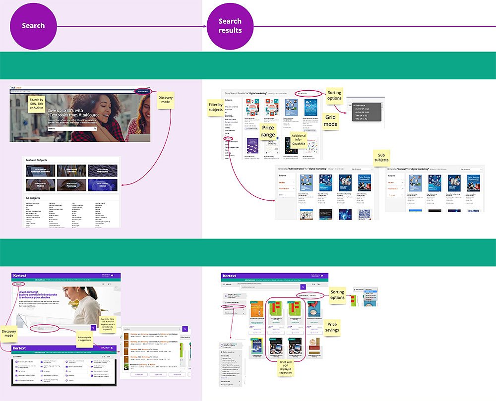
As part of this initial info gathering stage I also did an indepth dive into what competitors were doing to better understand how we performed in comparison and what market set expectations users might have.
Brainstorming session
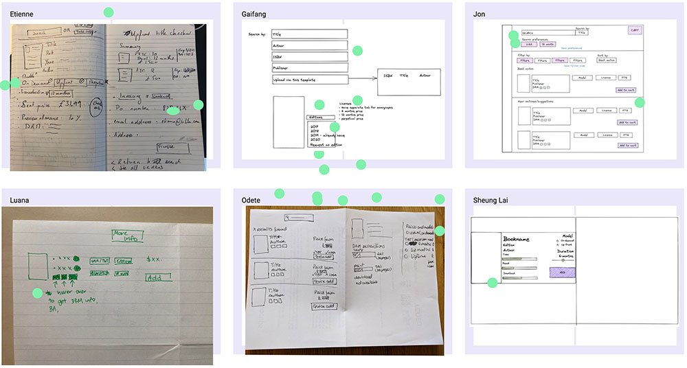
Looking to gather more ideas on how to improve this process, I conducted a brainstorming session with an assorted group of team members from several departments to ensure as many different perspectives as possible.
Wireframes and prototype
Identifying the main problems to tackle
From all my initial research a few key points emerged as major painpoints:
- The existence of different tabs for different models presented a usability challenge because some users weren't aware that they might have to look in the other tab even if they got no results in the current tab.
- There were more licenses available under each model but they weren't surfaced in the UI because of the degree of complexity and users had no way of knowing this unless they got in touch with customer support.
- License nomenclature wasn't universal and could get quite confusing.
It become obvious that our main goal would be how to simultaneously simplify the display of licenses and models available while also increasing the number of options.
Search results page direction
While our portal allowed to purchase directly from the search results page, with most of our competitors, you could only purchase from the book details page and not directly from search results. This was also inline with the behaviour of many popular shopping sites (eg. Amazon, Ebay, Etsy, etc.). I decided to follow a similar approach and provide only high level details in the search results and then present more in-depth info in the book details page.
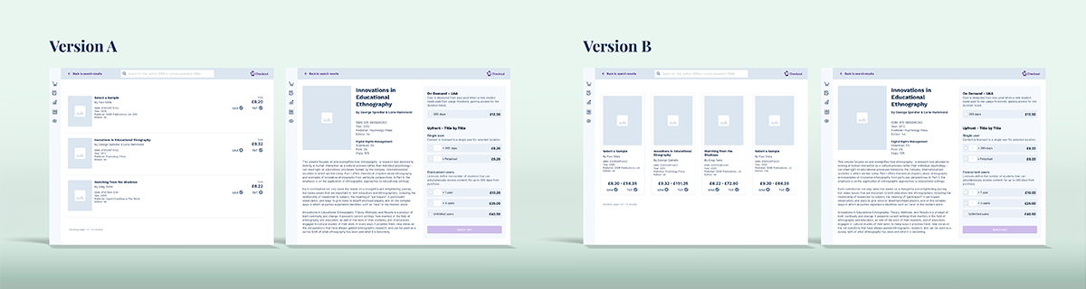
With that decision taken, the search results page still had to provide some sort of pricing information (even if not detailed) and which models it was available under. I decided to display tags with each book that would reflect the available models and therefore no longer need the existing tabs. Regarding what pricing information to display I was undecided on whether to display a minimum price or a price range, so I created 2 prototypes to see which one users preferred.
Simplifying licensing display
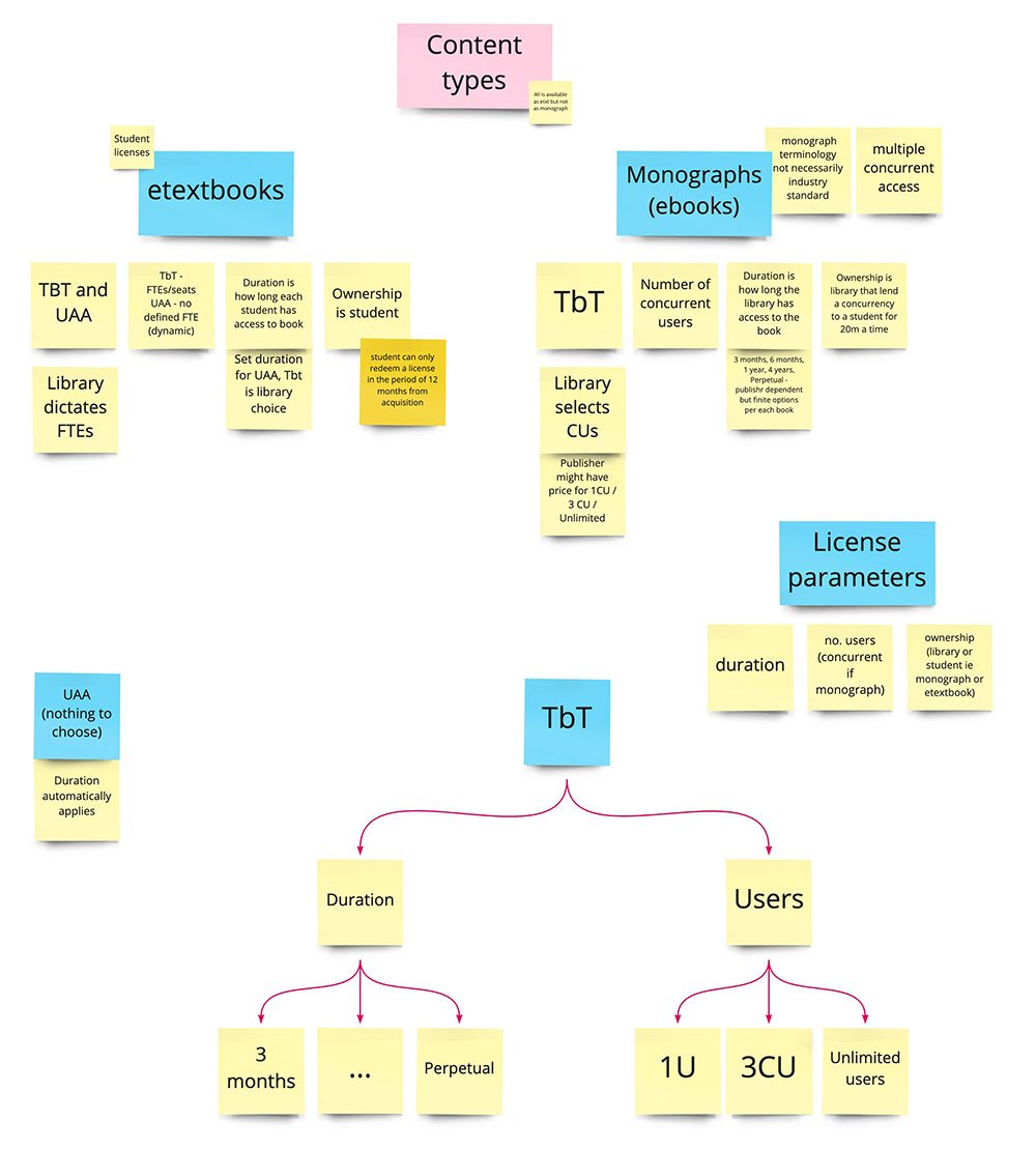
My next step was to get a better understanding of the license and models the company offered by speaking with our team and mapped them out in an effort of understanding how I could simplify their display.
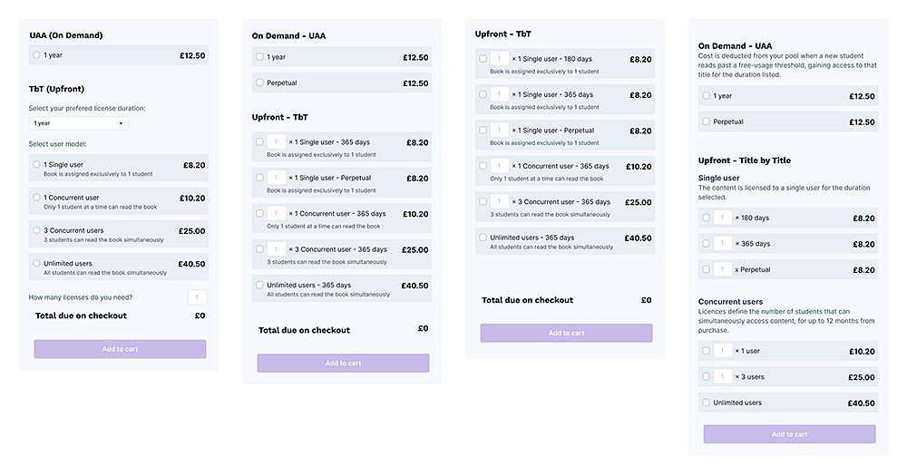
Having gotten an grasp of how they were mapped I did several paper based passes at trying to crack a way of presenting the prices in a way that could simply but effectively display all of the pricing combinations. After I crystallized a couple different approaches, I did some pricing panel wireframes and shared them internally to gather feedback and ensure I was accurately reflecting our pricing structure. With the feedback I received, I iterated on the design of the panels a further couple of times. At that point the big question that remained was whether users would want to acquire several versions of the book under different licenses. Seen as I was planning to test 2 versions of the search results page, I decided to also test 2 versions of this page.
Hypothesis and prototypes
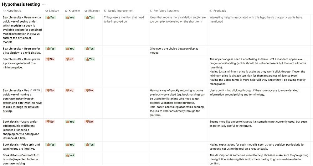
I broke down some of the main hypothesis we wanted to test, to make sure the prototype accounted for all of these:
- Search results
- Users want a quick way of seeing under which model(s) a book is available and prefer combined model information in view vs current tab division of models.
- Users prefer a list display to a grid display.
- Users prefer a price range interval to a minimum price.
- Users want a quick way of making a purchase instantly post-search and don’t want to have to click through for detailed pricing.
- Book details
- Users prefer adding multiple different licenses at once to a shopping cart to adding one instance at a time.
- Price split and terminology are intuitive.
So having decided what hypothesis I wanted to validate, the best way to do so was to do some A/B prototype testing, so I could account for some of the hypothesis where direction was less clear:
- Prototype A
In this version a minimum price would be displayed in search results and users could only purchase a single book license at a time. - Prototype B
Users would be exposed to a price range that would cover all available licenses and could purchase multiple licenses at once.
User testing
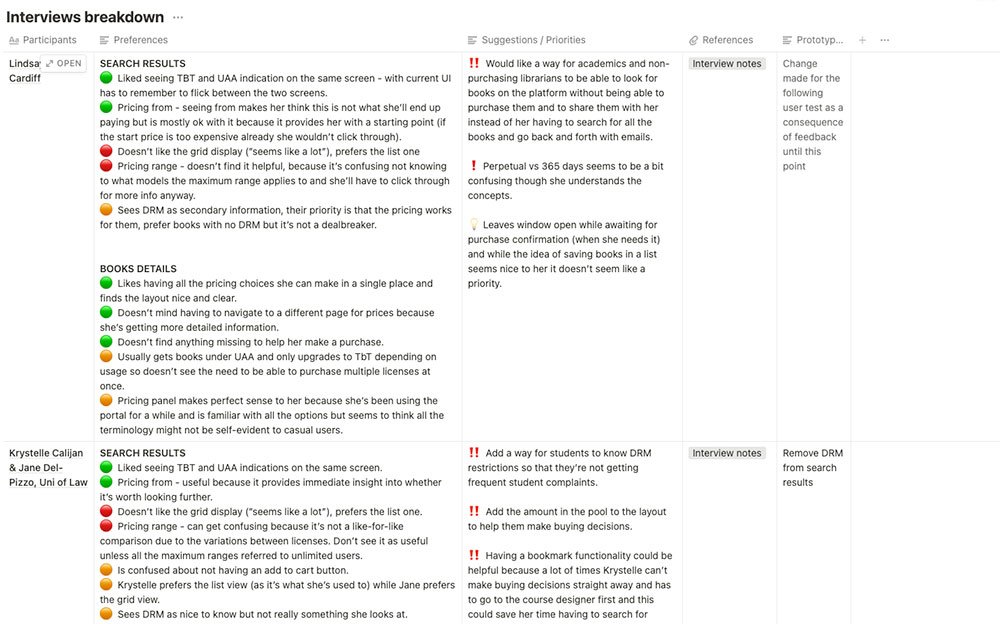
Once the prototypes were concluded it was time to share them with some of our users to gather feedback.
The reaction was overwhelmingly positive and the consensus was that the extra click needed to acess further pricing details wouldn't be instrusive if they were provided with more compreensive and clearer pricing display.
An unexpected piece of feedback from one of the users, was that with this new layout they'd feel confident to roll out the platform to more of their team members without dedicated internal onboarding. At the moment, getting more of their members to use it required internal training into the meaning of the licenses which wasn't a priority task for them, but with the new layout this would stop being necessary.
UI
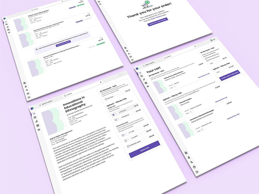
Once the prototype was validated it was time to flesh out the UI, covering the full width of the journey (ie cart view) and preparing for all potential edge cases.